Thursday, 15 December 2011

Evaluation

In what ways does your media product use and/or challenge the typical conventions of a magazine? To ensure that my magazine is recognised as being of the alternitave/rock genre by the target audience I have followed some typical conventions, this also ensures it is appealing to them. To also ensure that my magazine stands out and has a uniqueness I have done things out of the ordinary challenging conventions for example, advertising the website on the front cover. To better show how each page of my media product follows or challenges conventions I have made presentations using prezi.


In which ways does your media product represent a particular social group?
My magazine is aimed the alternative/indie rock culture, people who like to be unique and have quirky styles and listen to heavier music that wouldn't be classed as mainstream or "normal". Typically the style of people of this culture consists of darker colours, strange combinations of clothes perhaps styles no longer in fashion such as  80's and 90's fashion, dark makeup and quirky haircuts and haircolours
This can be seen in these photos of the The Japanese Voyeurs and Paramore, who are popular within this culture.
Girls within social group culture look up to female artists within this genre as they are succesful females who got to where they are based on talent alone and aren't afraid to have a unique style and ideas and opinions rather than falling into passive femininity relying on their looks and sex appeal to make them money, and the boys of this social group often find this an attractive quality within girls.
 I feel my product represents this social group well as the magazine features articles about the artists that would appeal to this social group and they would be able to relate to my fictonal artist as in the images used I am wearing unusual clothes in darker shades, have one side of my hair shaved and a neon pink fringe and peircings. My artist is also represented as an independant, quirky character who got succesful because of her talent and hardwork, in the interview.

What kind of media institution would distribute your product and why?To find out what media institution would be most likley distribute my media product I researched which institution distributed a magazine from the same genre as mine, Kerrang Magazine

As Kerrang magazine is aimed at the same target audience and social group as my magazine. I feel Bauer Media Group would be most likely to distribute my magazine. They would best know how to market it, where to sell it and how to make it gain popularity amongst the target audience. Kerrang is a very successful well known brand and Bauer Media Group have 136 years experience operating in 15 countries with a worldwide distribution figure of 38 million magazines a week.

Ways of distributing my magazine and brand other than the traditional magazine to make it more accessible to my target audience could include it on line on a website, as a downloadable file, and as an app to; IPhones, IPads and Android. It would also be beneficial to my magazine to advertise on music channels of the same genre, advertise at and sponsor gigs of artists from this genre and within schools/colleges.
Who would you define as the target audience for your product? 
I had a basic idea of who my target audience would be when I picked this particular genre for my magazine. To better understand my target audience, how would be best to aim my magazine at the social group and find out how popular this genre was I created a questionnaire on Google docs and asked people to fill it out via a social networking site, these were the results of the responses I got.

I then picked one person who enjoyed listening to the indie/rock genre of music and purchased and read music magazine similar to mine.

The person I chose was Cally, as can seen in the photo above. Cally is 17 and is a full time student at sixth form. I asked Cally some questions to better understand my target audience.
Her hobbies were socialising with friends, listening to music and attending gigs; both high profile and underground local bands. She listened to a range of music mainly from the indie/rock sub genres including  alternitavegrime-core, pop punk and post hardcore. She described her style as whatever she liked, rather than following trends she wears clothes and outfits that appeal to her and liked to find unique things that not many other people would be wearing.
After my research I was able to conclude that my target audience would consist of both males and females, ranging from the ages of 15-25 and would fall into an alternative social group away from mainstream culture.
How did you ensure to attract and address your audience through your product? 
Once I'd researched my target audience and had a better understanding of their lives and things they liked  I had a better idea of how to best aim my product at them. 
What have you learned about new technology and software during the process of constructing your magazine? 
I used a variety of technology and software during the process of constructing my magazine, some I had existing knowledge of, some I learned new skills and some completely new to me.
The main technology used during the process of construction was a digital camera and a laptop/computer. Both of these things I had existing knowledge of how to work and how to achieve the best results from them.
The two main pieces of software used in the construction were Photoshop to edit images and construct my magazine pages and Blogger to upload all my research and work.
I had used Photoshop before but had very basic knowledge of it and the variety of tools and effects available on the software. Using online tutorials and asking for advice from peers I managed to make the most of the software, produce quality pieces of work and learn new skills.
I had never used Blogger before but it was pretty easy to pick up and I grasped how to use it to best advantage within about 20 minutes. It is very similar to a blogsite called Tumblr which I use to run a blog in my spare time.
Other pieces of software I used which were totally new to me were Google Docs, an online application that allows you to create questionnaires and surveys, collect data in a spreadsheet and present it how you wish and Prezi, online software that allows you to make interactive presentations. I found the software easy to use as the websites had interactive tutorials and we were shown how to use it. I feel I have learned a lot of useful skills from using these new software programs that will come in handy in other subjects and areas of life.

In what ways do you feel you have progressed from the preliminarary task to your final product?

How do you feel about your overall product?
Overall I am very pleased with my product, I feel it looks proffesional and is easily recognisable as a music magazine of the rock genre. It looks similar in comparison with existing music magazines of this genre such as Kerrang and NME and I feel I have used and challenged conventions in a positive way achieving my desired look. I used the knowledge I gained from my audience research whilst creating my magazine to ensure it was being aimed at my target audience and appealing to them.
What have you learned from this experience that may help you were to create a similar product in the future?
If I were to create a magazine again in the future I have learned a number of things and gained various skills from this experience which would aid me in this.
The first thing to do would be audience research to ensure you know what your magazine should look like and feature in order to appeal to the right people, no matter how good the production of a product is if it isn't aimed at the audience correctly its useless.
I have gained a lot of knowledge about conventions, layout and imagery to ensure that your magazine looks appealing yet proffesional and feel I could do the basic set up of a magazine with ease.
I also learned about a lot of software I didn't know was available to me to aid you in your research, planning and actual production. Being able to access and correctly use the software and tools available increases the overall outcome of your product and how proffesional it looks.
If I were to create a similar product again in the future I would ensure the images were of a higher quality. My images were taken using a personal digital camera so the clarity of the images wasn't to the highest of standards. A proffesional camera would have meant a better outcome.


Wednesday, 14 December 2011

Double page spread- final draft


This is the final draft of my double page spread. As suggested by my peers I have moved the page number "82" to the left hand side of the page and agree that this looks better and more typically follows conventions of magazines. It was also suggested that the closing paragraph blends in with the main text too much and I should change its colour or font. I felt that making the text a different colour would negatively affect the overall look of the page. Whilst looking through other magazines I saw that coloured squares were often used to represent the end of an article and break up chunks of text. I added a red square to the end of the main text of my article, this breaks up the text and the sticks to the colour palette. I also noticed that in my first and second draft I'd missed the word "it" off my quotation on the first page and rectified this.

Contents page - final draft


This is my final draft of my Contents page. I havn't changed much on this page, as with my second draft things that were suggested to me would have meant rearranging the whole layout and I feel the layout looks proffesional and dont want to change it. I have placed the letter R in the same style as the one in the title on the front over in the left hand top corner of the magazine. I felt the page needed something more to look finished, not only does it look good brings consistency through to the contents page.

Front cover- final draft

This is my final draft of the front cover for my magazine. I am very pleased with the way it looks and feel it looks proffesional and sticks to the conventions of a music magazine of this genre. As suggested by my peers I have altered the banner across the top of the page and made the text more precise and the font clearer.

Tuesday, 13 December 2011

Peer feedback

 To get feedback from my peers I created a facebook group. I uploaded the images of my magazine and asked my peers if they would give me feedback on things they like or suggestions they had to improve my magazine by commenting on the images. This is the feedback I received.


After recieving this feedback I have looked over my pages and took these points into consideration, aswell  as analysing them from my own point of view and have decided to make a few changes in order to create the final drafts of my magazine

Monday, 12 December 2011

Double page spread- amendants


This is my second draft of my double page spread. Again I tried to improve the clarity of the images and used a red eye tool to fix my eyes to try and make the images look more proffesional. I also added a copyright disclaimer and copyright logo to the images, again to try and make them look more proffesional. I added solid black lines after the page numbers, like on the contents page to try and increase consistency through the magazine.

Contents page- amendants


This is my second draft of my contents page. I improved the clarity of the image and used a red eye tool to fix my eyes, I also added a copyright disclaimer along with the copyright logo to the image. This makes it look more proffesional. A peice of feedback I received was to try and add more images to the contents page, I thought about how I could do this in many different ways. However the only other original image I had was of Hayley Williams which I took at a Paramore gig and wasn't quite sure how that would be relevant to any of the features or how I would fit it into the layout without ruining the setup.

Front cover- amendants


This is the my second draft of the front cover of my music magazine. I tried to sharpen and clarify the main image as best as I could however the image can't be completely fixed. Other than that I am pretty pleased with the overall look of my front cover.

First draft feedback


This is a feedback sheet for my first draft of my magazine I received from Kaye, my lecturer. I received a lot of positive feedback for my magazine, however some suggestions were made of what I could do to improve my magazine.

Double page spread- first draft


This is the first draft of my double page spread. I have followed conventions such as breaking the page into columns and placing images within the articles, having larger blown up quotations and introducing the artists at the beginning of the article and ending with dates of material release from the artist. I structured my interview in a fan based Q&A style. I took images of my friends from their facebook with their permission and placed them in polaroid frames, I then placed names, ages and questions they'd asked the artist in bold font next to their pictures and went on to answer them from the artists point of view. I am happy with the outcome of these pages and feel they look similar to ones I've researched and represent articles from a magazine of this genre.

Contents page- first draft

This is the first draft of my Contents page. I am happy with the outcome of this page and feel it looks proffesional and not much different to the ones I researched from similar magazines. I tried to make the layout simple and clear yet effective. I used the page divisions I found in magazines of a similar genre and used the same colour pallette I used on the front cover. I broke the page up into feature pages, every month, and pages from the front cover including the main story.The original images I have used are of me and Josh Francesci of You Me At Six which was taken a gig. I featured articles and stories which would intrest the target audience of a magazine of this genre.

Front cover- first draft

This is the first draft of my front cover for my magazine. I feel it has turned out quite well and looks proffesional and resembles a magazine similar to the ones I researched. The magazine logo and masthead was created using the font Myriad Pro, I then added an effect on photoshop to make it look worn away, used an eraser tool to take away some parts of the text and used a paint tool to add drips and splatters. This makes it look as if the text has been spraypainted on and adds to the grimy rock feel of the magazine. Across the top of the page I have talked abut what sort of things are inside the magazine and used the phrase "uk's number 1 music magazine". This is to give the audience an idea of what they can expect to find when they purchase the magazine and to reassure them that this magazine is value for money and has a lot of articles inside. I tried to use sell lines I thought would draw in and intrest my target audience. I included: the main story, the fictional interview with me, an exclusive on confirmed acts for Download festival, gig reviews and what other bands you can expect to find inside the magazine.

Friday, 18 November 2011

Original images

These two images aren't of very good quality and I wont use them in my magazine, in the first image the focus isn't right and makes the picture blurry ruining the quality. The second picture is taken at an angle and I also dont like the pose in the picture as it looks forced rather than natural making it unaesthetically pleasing.
These three images came out the best. The quality of the pictures came out decent. however the first image is a little blurry. Despite the fact the focus is off I think it would be a good image for the front cover because of the pose and the shot. I will fix the clarity of the picture using photoshop when I put my front cover together. I will use these images throughout my pages im going to produce.

Photo shoot recce

As my photos are being taken in my own dining room there will be electrcal appliances, furniture and possibly food and drink around the area the images are being taken. To minimise these things posing risks I will unplug and put away electrical appliances, move all furniture to avoid trips and injuries and ensure the area is free of food and drink.
The weather wont affect my images as they are being taken indoors.The time of day could affect the outcome of my images as if there is too much natural light coming in through windows it could cause a glare and affect the quality of the outcome of the images, but if there isn't enough natural light and a lot of artificial light is used my images could have a yellowish tint to them. I will use a flash to help the overall contrast of the images seem more natural and the images will be taken against a plain matte wall to avoid refelctions.
Taking my photos against a plain wall will allow for easy editing and will mean I can leave the background in image if i wish without affecting the image quality.
The main images of me will be taken in my home so I won't need permission from anyone. The photos of artists I am going to use were taken at the O2 academy in Newcastle and I checked that photography was permitted at the gigs beforehand. The photos of my friends I will use are images they have taken themselves for profile photos online and allowed me to use after asking permission.
I am not reliant on anyone but me and the member of my family I ask to take the images, because I am using myself as a model. However as I am working as part of a pair and we are creating two issues of the same magazine we are both reliant on the other person to do their bit for the completion of the product as a whole.  

Photo shoot planning

I have chosen to photograph myself for my images as I can create the look I visualise easily without having to rely on anybody else or get permission. It will be less time consuming as I dont have to work around when they are free.
I will keep my images very basic using a plain background and miminal props. I will use chairs or boxes to sit on and perhaps a music related prop.
The makeup and costume will have a edgy rock feel to it in keeping with the theme of the magazine. I will use dark clothes, leather jackets, dark eye makeup etc. I also have a neon pink fring and peircings that will help with the rock look of the images.
As I am using dark colour for costume and makeup I will take my images against a lightly coloured neutral background to create contrast. The bright colour of my hair would mean bright colours in the background or in the costume would make the image look fussy.
My photos will be taken indoors, in my own dining room against a plain cream wall with no furniture in the area. I will ensure that lighting both natural from windows and from artifical sources will be behind the camera allowing clear illumination of the focal point. This will allow for clear detail in the photos.
My images will be relevant to the genre of the magazine as I want my artist to grab readers attention and make them read the article on her.

Photo shoot ideas

These are some images I gathered from the internet from photoshoots with Hayley Williams of Paramore and Sierra Kusterbeck of VersaEmerge. I like the poses in all four of these photos and think they could work well in my magazine. I like the lighting and overall look of the three images with Hayley Williams. I like the rock chick feel Sierra's body language and facial expression create.

Costume and make up ideas

These are some images of outfits similar to those that I would like to use in my original images. The look I am going for is edgy rock chick/grunge inkeeping with the magazines genre. Therefore my costume will be made up of things like leather jackets and knee high socks.
These are some images I gathered of hair and make-up looks I would like to use in my orginal images. Inkeeping with the rock chick/grunge look I will use dark eye-makeup and I have a neon pink fringe which will add to the look.

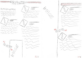
Double page spread flat plan


Rationale Questions

I will bring the colour scheme I used on the front cover and on the contents page though onto the double page ensuring consistency and sticking to the typical conventions of magazines of this genre.
The images used on the double page spread will be original images of me and friends. The main images will be of me and I will place them amongst columns of texts. I will place images of my friends in poloroid frames and place them in columns next to text giving the impression that fans have sent in questions and pictures of themselves.
I will use the same fonts that I used on the cover and contents page again ensuring consistency. The text on the double page spread will be mainly the main body of the article and I wil include some blown up quotations from the article alongside the images as I have found this is quite common in interviews with artists.
I will put the title across the top of the page then split the first page into columns, I will introduce the article in italics then go onto the main article. The set up I have chosen for this article is a fan based Q&A. I will place one of the polaroid pictures along with a name, age and their question in bold then answer it as if the artist is answering it. I will place an original image somewhere between columns. The second page will be split in half using one half for an image and a quotes and the other half for the rest for the interview and closing statement.

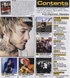
Contents page flat plan


Rationale questions

The colour scheme used on the contents page is the same as the one I chose to use of the front cover. This will ensure consistency throughout the magazine, stick to typical conventions and is also minimalistic which means the page will look proffesional and neat.
The images used on the contents page will be an original image of me and an original image of an artist I have taken at gigs etc. The image of me will again use makeup and clothes to create a rock look and will be placed in the "main feature" box. The original image of an artist will be placed in a column alongside a relevant story.
In order to create consistency throughout the magazine I will use the same fonts I used on the cover, with main headings being in the bold red writing and smaller writing being in myraid pro. The text featured on the contents page will be short snappy lines describing features and stories and their page numbers, this is to ensure the contents page look neat and doesn't give away too much intriguing the audience to read on.
The layout will be typical of a magazine of this genre. I will have the word "contents" and the date across the top of the page. The left hand side and across the bottom of the page will be dedicated to what you can expect to find in this issue and most of the space on the right hand side will be dedicated to the main feature from the cover. Images will only be used on the right hand side.

Front cover flat plan


Rationale questions

The colour scheme I have chosen consists of Red, Black and Grey. I have chosen to use these colours as I found it to be common convention in music magazines to use a basic three colour palette, and magazines of my chosen genre usually use these three. This ensures that my magazine is easily recognisable to the genre, yet still looks appealing and visually pleasing. The main image I will be using on the front cover will be me. No props will be used in the image but I will use costume and makeup to acheive a rock chick look inkeeping with the magazines genre. The background of the image with be grey gradient, this will ensure the main focus of the image is me and it blends when placed on the magazine.
The font used on the front cover of the magazine will be consistent throughout. It will simple and bold to allow it to stand out. All the text will be placed horizontally as to not distract attention from the main image and sell lines and to ensure the front cover looks neat and organised.
My masthead will stretch across the top of the cover, in a style similar to that of Kerrang magazines. I will have a main sell line (the fictional interview), in a larger font. I will also place various features and extras around the cover, ensuring they do not over clutter the cover and look neat whilst at the same time giving the impression that the magazine is value for money and has a lot inside.

Target audience and research


This is a questionnaire I created using google documents to help me research the target audience I would be best aiming my magazine at. I embedded the questionnaire on my blog and asked people if they would complete my questionnaire on music intrests and music magazines. I got 10 responses back.

This is a screenshot of the responses. From these responses I can conclude that my target audience on average would range from 17-19, however people younger or older may also be intrested. Listening to music and attending gigs is a big intrests amongst my target audience and I should take this into consideration when designing my front cover to attract readers. Most people would be willing to pay £3-£3.99 for a music magazine, to ensure people get value for their money the magazine should have a lot of intresting features. The gender of my target auidence is mixed.

Inspiration for double page spread


This is a double page spread from Kerrang Magazine with Josh Franceschi and Oli Sykes. The colour scheme is mainly black and red which can be found on the front cover and contents page. Using the same colour scheme all the way through the magazine, means your brand is easily recogniseable, ensures consistency and looks more neat and proffesional. The layout is simple which is what makes it so effective, the main image is on the right hand side of the spread with the main text, quotes and smaller images being divided into columns on the left side of the spread. This looks tidy and makes it easy to read as the page doesnt look to busy.
 

This is a double page spread from NME magazine with Two Door Cinema club. The features of the page are similar to that of above in that there is a big title, a large main image, smaller images quotes and main text divided into columns. However the actual layout of the page is diffferent with the picture being placed in the right corner and the text being fitted around that. I think this makes the page appear cluttered. There isn't too much colour on the page, other than the image its mostly black. I feel this is too simple and doesnt look visually appealing, also because the text isn't broken up by subheadings or colours there appears to be a lot of writing on the page which may put people off wanting to read it.

This is a page taken from Kerrang Magazine. It usually features at the back of the magazine, singers get asked questions sent in by fans and answer them. Although this isn't an example of a double page spread directly I like the idea of having the main text on my double page spread being set out in a fan Q&A style.

Inspiration for contents page

This is a contents page from Kerrang Magazine. The layout is simple and organised yet still looks visually appealing and the various conventions used make it obvious it belongs to a music magazine. The contents page has brought through the same basic colour scheme and fonts used on the front page which ensures consistency and makes it more effective. I particuarly like the way the feature listings have been organised with the main story in a big box with a image and the other stories down the side in a column and around the main image. The page is broke up by headings and sub headings with clear page numbers to make it easy to find which feature you want to read.
This is a contents page from Kerrang Magazine. The colour scheme is similar to the one above meaning the brand is easily recogniseable by its colour pallette yet still looks appealing. Although the layout of the page looks different to the other one the basic set up is quite similar. The main story being given a big space with an image then the smaller stories being organised in a seperate column. The clear headings, sub headings and page numbers have been used again.
This is a contents page from NME. The colour scheme is mainly red but inkeeps with the theme of NME making the brand easily recogniseable aswell as sticking to music magazine conventions. The layout is similar to that of kerrangs however down the right hand side theres a band index telling you what pages you can find features about your favourite band.

After looking at these contents pages I have decided that the colours and fonts I use on the front cover I will bring through to the contents page, I like the layout of the Kerrang magazine contents pages and would like to use a smilar one in my magazine.

Inspiration for front cover

This is a front cover of Kerrang Magazine. a magazine of a genre similar to mine, with Hayley Williams of Paramore as the cover model. I like the colour scheme of this front cover, its basic yet looks effective and neat. I also like the overall layout and the way the images and text are placed on the page.  
This is another Kerrang front cover with the members of Bring Me The Horizon as the main image. I again like the basic colour scheme, it is very similar to the colour scheme of the cover above in that the palette consists of three coloursI again like the layout of the cover, it gives the impression the magazine has a lot of interesting content yet doesn't look too cluttered.
This is a front cover of NME magazine, again a magazine of a similar genre to mine, with Crystal Castles as the main image. Although this is a different brand the basic colour scheme and layout of the magazine are similar to that of Kerrangs. The layout is very similar also with the masthead being placed central or to the left, the main image and sell line being central or to the right with the smaller stories arranged neatly around it  and the barcode and issue number in the right hand corner.  

Moodboard

This is a moodboard I have created using images I collected related the indie/rock genre, that I will take inspiration from when designing my magazine.

As brief and Inital Ideas

Brief
Create the front page, contents and double page spread of a new music magazine.Initial Ideas
After looking at a variety of genres I have decided to create a magazine of the Indie/Rock genre. My magazine will follow the typical conventions of this genre with a colour scheme of mainly black, red and grey. For my double page spread I will create an interview with a fictional up and coming artist. My target audience will be both sexes and the age will most likely be 15 upwards, however anyone that enjoys this genre of music would be intrested. It will be a national magazine.

Prelimanary task

For my preliminary task I created a student magazine for City of Sunderland college, Bede campus. In order to create my magazine I looked on the college website at particular events that were being advertised that would make good features. I also looked on the BBC education website for any other information I could use. I created the magazine using Photoshop, I found this easier to use than Publisher. Photoshop allows me create layers and manipulate shapes and images easy. Creating this preliminary task I gained a lot of skills and discovered a lot of tools that will help me when creating my final product.
Feedback I received "(A-), Fantastic work Nicola, this looks the part of a college magazine with clear understanding of conventions, good layout, sell lines and composition. Contents page fairly sparse and lets you down"